Re: SWOS remake art & opinions wanted
- Masakari
-
 Topic Author
- Visitor
-

I disagree with many of the assessments regarding a new game. If you want to port to modern systems you kind of already have that on Gog.com, SWOS 96/97 has always been on sale there (yes, I know its DOSbox, not updated ). If you want to relaunch SWOS as a franchise you need to be an actual modern game, so the old audience will still enjoy the classic gameplay and improvements, and a new audience won t feel like they re playing 20 year old software with silly limitations.
Why would anyone want Windows 10, or 11, or 12, to look exactly like Windows 3.11? The UI has evolved, it s similar and you can clearly tell it s still Windows, but the user experience is better and it looks sexier to boot.
I also think any approach to this would require a vertical slice, otherwise it s just words.
As of 2016:
+ Chris Chapman has been out of the industry for 15 years and is working for a web visualization company;
+ Stoo Cambridge did the updated art on the XBLA version, and also worked on Alien Hominid, Actua Soccer 2006, Family Guy Stewie s Arsenal, Yamaha Supercross and 1000 Tiny Claws. He was working on Blobbit , an old school game, the site and FB page for that game seem static or abandoned;
+ Jon Hare is, of course, working on Sociable and since any proper SWOS revival would be direct competition, I doubt he can or will help.
Good questions petarku, regarding the code and even the XBLA version. I think only talking with someone from Codemasters and the original team (like Chris Chapman) will provide clarification.
Please Log in or Create an account to join the conversation.
Codemasters tried to use fan updates for XBLA SWOS, but were incapable to get career mode running. Embarrassing... (needless to say, we offered help to fix that but were ignored, ofc!)
PS: I think after 4 years Jon wouldn t have a problem that I make this public!
Please Log in or Create an account to join the conversation.
Can you make a mock-up, what you mean by using modern menu and set up structure that fits into SWOS look and feel? At the moment I have something in mind, wich did not really fits to SWOS.
Let me say this. I am really happy with SWOS 96/97 and I really have no problems to play it on old hardware or emulator for my whole life. It just would be great to have SWOS with new features, like unlimited seasons in career mode, adapt championsleague and europe league system of these days, add new competition like confederations cup and so, update DIY tournament mode with more teams and bigger groups possible and so on. So just do some add ons and basic features added to the old game.
I can accept a new menu structure, but for me it should be 100% respect the look and feel of the old style. Even if the gameplay in a SWOS match is feeling like the old version, it could prevent me from enjoying it 100% if the feeling of the rest of the games don t look and feel the same like old versions. Don t get me wrong, I really understand that it could be needed (but maybe not) to make changes to the game if you try to get new/younger people to get in touch with this game. But is it really what we want? For me a new SWOS Version is mostly about new cool featured but not about changing to a different look and feel to maybe appeal another audience that never was in touch with oldschool/retro football games before (wich will be very hard for a major audience as a lot of people that never played SWOS or Sensible Soccer and trying it out for first time these days are confused about the gameplay and have feelings about it is a bad game, because you play with one button or it is to hard to master - I think SWOS is mostly interessting for players that like old games and these people are more used to oldschool interfaces).
So it would be really nice to see some concept arts what you have in mind. In that way I can understand better, what do you mean by modern interface into SWOS. I will 100% support a new version of SWOS, but only if I have the feeling that it preserve 100% of the look and feel of the old versions in any way. Xbox 360 version was very good in this look and feel thing.
Please Log in or Create an account to join the conversation.
- Masakari
-
 Topic Author
- Visitor
-

I should be surprised by that, but having worked in the industry for a few years I m really not. Like I mentioned before I m going to refrain from public trash talking about these types of situations because I don t want to have future problems. I ve had a run in with EA early in my career, and it wasn t a pleasant experience.Fun fact:
Codemasters tried to use fan updates for XBLA SWOS, but were incapable to get career mode running. Embarrassing... (needless to say, we offered help to fix that but were ignored, ofc!)
Interesting... so judging from those emails and the dates, eventually the idea to approach Codies and use SWOS was abandoned for doing Sociable. And again judging from both the tone of those emails and your own comments here, it seems it was because Codemasters are a hassle to deal with.PS: I think after 4 years Jon wouldn t have a problem that I make this public!
@HairFU:@Masakari:
Can you make a mock-up, what you mean by using modern menu and set up structure that fits into SWOS look and feel? At the moment I have something in mind, wich did not really fits to SWOS.
Let me say this. I am really happy with SWOS 96/97 and I really have no problems to play it on old hardware or emulator for my whole life. It just would be great to have SWOS with new features, like unlimited seasons in career mode, adapt championsleague and europe league system of these days, add new competition like confederations cup and so, update DIY tournament mode with more teams and bigger groups possible and so on. So just do some add ons and basic features added to the old game.
I can accept a new menu structure, but for me it should be 100% respect the look and feel of the old style. Even if the gameplay in a SWOS match is feeling like the old version, it could prevent me from enjoying it 100% if the feeling of the rest of the games don t look and feel the same like old versions. Don t get me wrong, I really understand that it could be needed (but maybe not) to make changes to the game if you try to get new/younger people to get in touch with this game. But is it really what we want? For me a new SWOS Version is mostly about new cool featured but not about changing to a different look and feel to maybe appeal another audience that never was in touch with oldschool/retro football games before (wich will be very hard for a major audience as a lot of people that never played SWOS or Sensible Soccer and trying it out for first time these days are confused about the gameplay and have feelings about it is a bad game, because you play with one button or it is to hard to master - I think SWOS is mostly interessting for players that like old games and these people are more used to oldschool interfaces).
So it would be really nice to see some concept arts what you have in mind. In that way I can understand better, what do you mean by modern interface into SWOS. I will 100% support a new version of SWOS, but only if I have the feeling that it preserve 100% of the look and feel of the old versions in any way. Xbox 360 version was very good in this look and feel thing.
You can check my 2010 concepts in one of my galleries: masakariprime.deviantart.com/gallery/25733989/Project-SENSI
I tried to respect the Sensi look and I think you can tell it s inspired by the old interface. Most of them are a bit cramped, stuffed with too much text or information, they need a little bit more room to breathe.
You can also see some of the work I was hired to do for Tiki Taka Soccer, a 2014 mobile game: masakariprime.deviantart.com/art/Tiki-Ta...e-graphics-509241689
It s been 8 years and I ve started working on updated mockups of what I would do with SWOS 2020 , by my estimate it s gonna take me around 6 weeks for the whole thing, so stay tuned and I ll be posting progress updates.
Please Log in or Create an account to join the conversation.
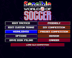
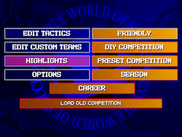
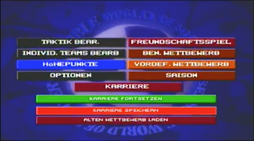
OGs AMIGA / PC DOS / XBLA (interesting: menu button color from Amiga, background from PC DOS):
In the end, we d need a small company behind it, willing to purchase code/license and willing to get serious fan/die-hard expertise in!
If you ask me, the answer is a SWOS made by the fans, for the fans. And by “fans” I mean longtime players like our community members, people who have invested enough time in the game to understand the depth and the unquestionable value of its gameplay.
If you do this then you don’t even need to worry about the UI (it may look outdated but it still serves its purpose well) or updated rosters (a non-problem, since users can update all the data they want). You just have to do justice to a timeless classic and bring it to run natively on modern systems.
With a little more effort, XBLA SWOS could have succeded in doing this. Its main problem was that it was just a (poorly marketed) lazy port with broken netplay, and zero post-launch support. Having the old roster with fake names didn’t hurt the game nearly as much as this.
Sure, the dev team would have needed to modify, or better yet, rewrite the source code to get around some of its limitations. As it stands, ball physics are altered as you change resolution, and the game can’t run at the same speed at different refresh rates. And, of course, no netplay.
I guess they weren’t given the time (or the money, or both) to choose that kind of approach, so they focused on cosmetic changes to the pitches/stadiums instead. At least they supported the 16:9 ratio, so we were able to see more of the pitch, but that’s the only “worthy” improvement that comes to my mind right now.
Oh, let’s not forget that: “SWOS is the first Xbox Live Arcade game to feature online ads. Massive Inc (owned by Microsoft) has supplied the code to enable banner ads.”
I am totally with you! Especially about this Massive Inc disaster... somehow I suspect this to have negatively effected the online gameplay of XBLA SWOS. But again, that s typical for Codemasters attitude towards SWOS, like let s just use SWOS for testing this new system, it s good as a guinea pig!
Of course you can also try to cater to the younger audiences and present the classic SWOS gameplay with a “modern” UI and new, flashy retro visuals. I just don’t know what their reaction will be once they get out of the menus and start playing. I can think of “OMG, just one button?”, and “Do I actually need to spend time to get good at this thing?”. Or maybe they will appreciate the depth of the gameplay, who knows.
I’m just saying the UI isn’t the first thing I’d bother with if I had the source code. First, I d try to get rid of the code’s limitations and port it to modern systems, for the people who have been playing the game online for all these years.
Then, you can easily build on that first re-release, revamp the UI, and even start working on the gameplay. Maybe add some modifiers at first, like:
- injuries: random (original gameplay) or depending on the predisposition for injuries skill (remixed gameplay)
- stamina: endless (original gameplay) or determined by the fitness skill (remixed gameplay)
On a handheld, SWOS could work. About the one-button issue... you can sell this to a younger audience with a smart kind of trick. Just tell them it has 4 buttons: Pass, shot, tackle, head! (in that case, only the shot button would need to be altered, simulating a longer pushing of pass button, that s it.)
Where in reality, it s just one, depending on where the ball is! Problem solved
Please Log in or Create an account to join the conversation.
- Masakari
-
 Topic Author
- Visitor
-

It s gonna be different now for SWOS 2020 .
Please Log in or Create an account to join the conversation.
First of all the menus looking good in it s own way but (1st impression):
Menu design looks like a football manager game. It did not look like SWOS or Sensi. For me it is to far away from original SWOS menu art to have the right feeling (I would not like a menu design like this in a final version of new SWOS).
For me perfect would be a modern version of original SWOS Menu (it did not have to be the same, but very inspired by original menu looking).
This (onyl this one) menu is looking nice. Very basic not much around look and feels not overload for a game like SWOS - pre00.deviantart.net/0897/th/pre/f/2010/...nu_by_gridlinked.jpg
Please Log in or Create an account to join the conversation.
- Masakari
-
 Topic Author
- Visitor
-

Thanks for the feedback. It s actually a very interesting discussion we should all be having - what is SWOS to you?@Masakari:
First of all the menus looking good in it s own way but (1st impression):
Menu design looks like a football manager game. It did not look like SWOS or Sensi. For me it is to far away from original SWOS menu art to have the right feeling (I would not like a menu design like this in a final version of new SWOS).
For me perfect would be a modern version of original SWOS Menu (it did not have to be the same, but very inspired by original menu looking).
This (onyl this one) menu is looking nice. Very basic not much around look and feels not overload for a game like SWOS - pre00.deviantart.net/0897/th/pre/f/2010/...nu_by_gridlinked.jpg
For example: is SWOS a pixel art graphics game, and any new version should keep that look? The XBLA version is on the edge as it has detailed pixel art sprites but then for the stadiums and pitch they are more tradicional 2d graphics. Take Kopanito All-Stars Soccer , for example - it s still 2d but it s cartoon drawn look and very polished. Would current year SWOS still need to be pixel art, or an updated art style wouldn t take away from its identity?
Sensi 98, Sensi 2006 and Sociable all went for cartoony 3d graphics and I never felt it resonated with what I think Sensi is.
Regarding the UI concepts from 2010:
First up, many are too busy and cramped, making them indeed a bit football manager-ish ; Too much information that needed to be presented in a clearer way;
Second, I did use many cues from the original UI, and I ll use these two images as an example:
- the same pixel art font
- horizontal rectangular block structure with negative space elements where additional text resides
- same elements present - player head, number, name, position, value
- highlight grading - in OG SWOS they use different colors, I still used colors but in a different way as outlined below
- the pitch with the players positions / formation
- the entire formations / tactics block
What I added from my own personal taste as well as better UX design and additional elements was:
- I identified that SWOS likes to use color in a bold way, but it does look a bit exaggerated today; I also wanted to color-code game modes and also different types of information;
- So I made the Interface mostly greyscale, with different trim / highlight colors for each mode (green for Friendly, light blue for Career, red for Superstar Hero aka Be a Pro , etc)
- Top trim with specific game mode color and screen navigation info so you don t get lost in cascading menus
- Highlight grading with starting eleven, selected player, bench, reserves but in greyscale
- Color-code information like player position as well as overall rating
- Useful modern elements like overall rating, individual stats and player info, as well as role selection (captain, corner kick takers, etc)
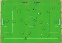
- The formation pitch turned black and positions displayed instead of player names, for more intuitive formation customization and understanding
- Bottom trims for useful commands (this was a mock-up for xbox 360) and custom soundtracks
Look at a greyscaled and color-coded version of the old screen:
Please Log in or Create an account to join the conversation.
Only thing I d change:
Get rid of the middle part with selecting captain, penalty, free kicks etc... (just add an extra layer for Set pieces ). Right now, it s too overwhelming, too full, if you know what I mean.
Also, leave the pitch background on the tactic area green... not grey/black! We re not playing indoor soccer!
Please Log in or Create an account to join the conversation.
- Masakari
-
 Topic Author
- Visitor
-

Thanks, yeah it s too full of stuff .Good effort. Looks nice, really.
Only thing I d change:
Get rid of the middle part with selecting captain, penalty, free kicks etc... (just add an extra layer for Set pieces ). Right now, it s too overwhelming, too full, if you know what I mean.
Also, leave the pitch background on the tactic area green... not grey/black! We re not playing indoor soccer!
I d love to see Futsal in Sensi style! It s right there in my Sensi 2010 pitch document ;D
Please Log in or Create an account to join the conversation.

